Establishing the first design system for the Playmaker brand initiative, with the vision to expand beyond
E.ON Next has seen a rapidly changing landscape within the customer-first home energy supplier market. As their digital services expanded customers were required to engage through multiple standalone apps. While each met a specific need, the overall experience became fragmented, creating friction across key journeys such as billing, usage, and service management, and increasing complexity for both customers and teams.
The wider product teams had to manage a suite of 8 mobile apps offering very similar consumer information. Coupled with increased maintenance and falling customer review and satisfaction scores, the business direction was to consolidate this down to a core set of 3, rebuild in React Native, and attain the updated Playmaker brand version, replacing the current corporate visual interaction.
Starting out
The need for a design system to conform to this design direction was evident, but the initial plan would be challenging to improve product teams' understanding of what a healthy, well-adapted design system is. Both design and development lacked experience working with design systems, and although leadership wanted a first phase of components created at speed, I needed discussions with key stakeholders and engineering on what was appropriate to build first and what would set us up on a solid foundational base.
Challenge one
Identifying priorities
To ascertain more thorough rationale for DS decision-making, I first spoke with our 5 product managers to understand current customer needs and see their feature roadmaps, as this discovery phase would ultimately inform my roadmap as I created the design system's first OKRs. This insight was indispensable for me to propose an alteration to leadership on my original goals. Original product sentiment, PM guidance, and further design system requirements were then broken down into quarterly deliverables, visible for all, highlighting their priority, effect, and status.
Early engineering engagement
As the Playmaker initiative was brand new, so were many team members involved. There wasn't a clear strategy in place for teams to adopt, so for the design system, I wanted to create strong relationships with development immediately to organize the best way of working. Our engineering lead and I agreed on a shared working approach for striking parity—component naming conventions, foundational principles, and alignment on what the development team would actually need first from me, besides Figma components.

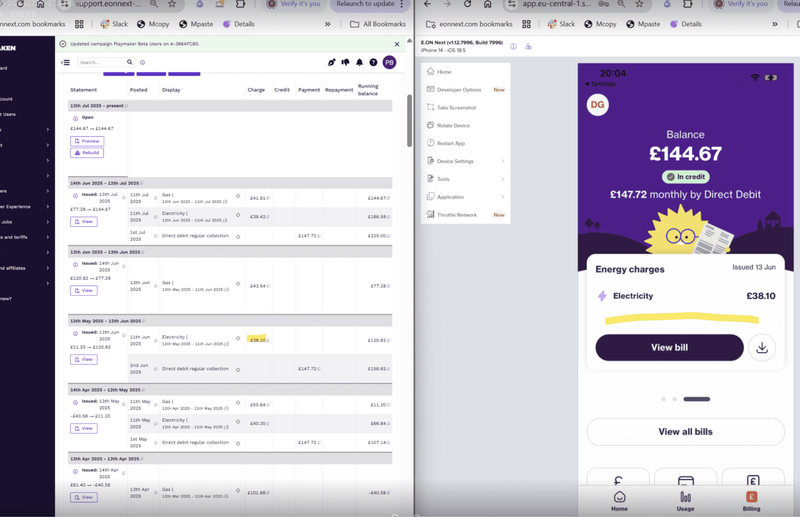
The early prototype was created from phase 1 components to test with users.
Setting foundations
Due to tight timelines, product teams were already underway with conceptual workflows, so foundational libraries needed creating in parallel. The first versions relied more heavily on existing design guidance (of which little was documented) and the separate design system used by the Web team, which had a very different design style and brand assets, such as character illustrations and colour values.
Expanding the brand beyond marketing limitations led to developing primitive variable collections, which informed a new semantic token structure. This underpinned Phase 1 component creation, tested during conceptual phases. However, working this way caused conflicts, as designs diverged from the core component library, increasing confusion among teams and hindering correct design system adoption.
Challenge two
Shifting the mindset to think above and beyond
Silo methods and bad habits can creep into our process over time and become the norm. This has significant impacts on how designers interact with engineers and fellow designers in other squads. Identifying duplication and misalignments early helps avoid issues later in development, and through solid communication - driven by the design system - it instills process change in how we share with each other, particularly in a remote setting.
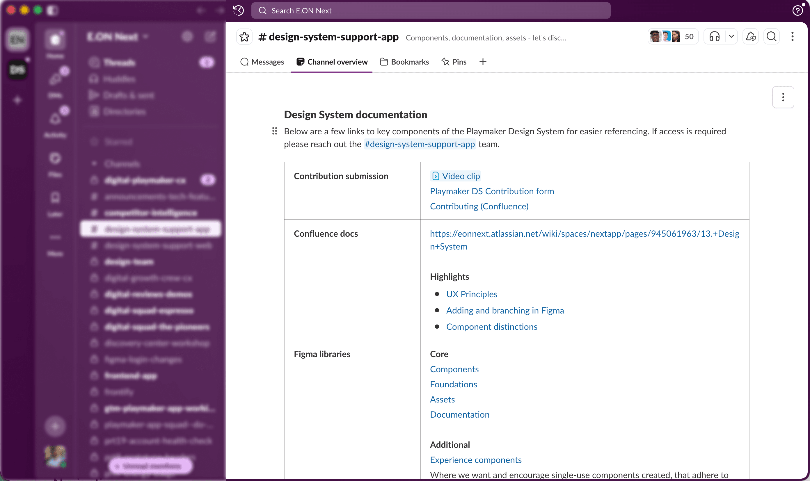
The design system support hub in Slack became not only the place to link out to libraries, references, and docs specifically for the DS, but also where I could encourage improved ways of working that had massive impacts on adoption rates.

Leveraging existing 3rd-party tooling
Once teams began to consume the first phase deliverables, momentum shifted into providing design and engineering with a greater understanding of all assets being served. Queries beyond component usage (motion, accessibility, prop configurations) now need further governance due to their extended usages.
Frontify was already being used by the brand team to house E.ON Next’s guidelines, and upon investigating its integration capabilities further, it was accepted as a useful tool to contain all new design system documentation. Continuing with the brand team’s site architecture, I have been able to create a scalable reference resource that, although it doesn’t support many custom DS-related features, can provide consumers with correct guidance that will continue to grow when the design system expands to support all customer-facing apps.
Challenge three
AI integration
The ability to interact with component prototypes and adjust props is as important as any documentation. However, as the app requires it to run on a native runtime, Storybook integration was a non-starter. But as one door closes, another opens, and this gave me the opportunity to leverage Figma’s MCP to create interactive versions of core components instead.
My preference has been a mixture of both Cursor and VS Code, harnessing Gemini Code assist to initially create basic components with limited interaction, which has developed to greater complexity, including;
Custom prop adjusting
Variant management
Keyboard navigable and screen reader ready
All served by our base variables .JSON file.
Figma plugin creation
Another opportunity identified was improving our asset discovery for designers. E.ON Next has a plethora of brand assets (characters and iconography) on offer that were difficult to source, meaning consumers were often using a smaller range within UI.
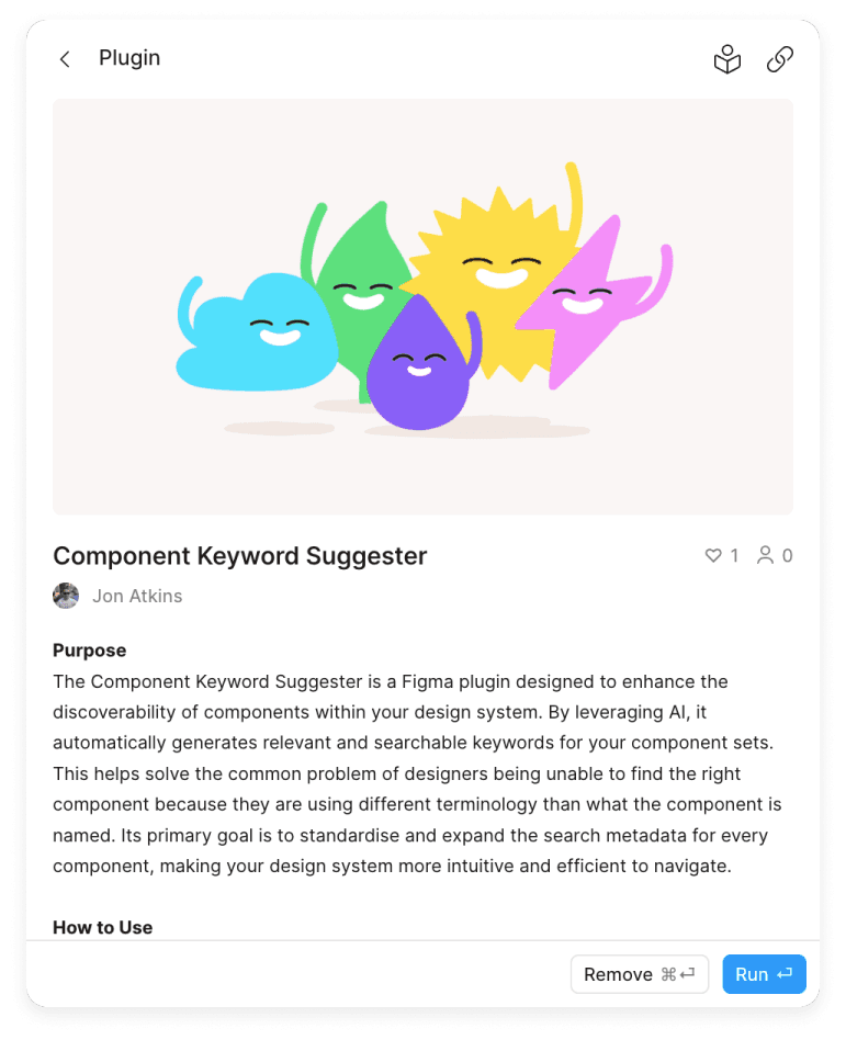
To improve this visibility, I used Figma’s API to create a custom plugin that auto-generates related keywords for any component. These can then be added to each component configuration description to help with icon discovery. This has currently seen an almost *33% increase of individual icon consumption in our library. Enhancing this discoverability has made it easier to find more suitable icons, aiding our customer experience.
*Based on instance analytics in Figma prior to plugin release
Playmaker stats
*As of end of December 2025
Effecting positive change in larger organizations takes time—multi-squad alignment, budget and time restrictions, and 3rd party tool integration causing delays. In retrospectives, many shared issues were difficult to change, so adapting to the landscape was challenging. Frustrations were equally echoed in app squads with length of estimates on tasks and testing environment blockers.
Playmaker App CHI (Customer Happiness Index)
Current CHI on the OG App
Overall improvement vs. OG
In amongst all this, however, scaling a design system to serve an increase of 150% more mobile applications, including an additional 42% component creation, pushed adoption rates in the right direction. Opening our documentation beyond Figma also gave other product team members the opportunity to not only consume but also contribute to our guidance, such as UX writing and accessibility guidelines.
Credits
©2017—2026 Selected works / Jon Atkins