Challenge one
Redeveloping the design system from the ground up, improving accessibility and constructing full documentation
I joined Productboard in October 2022 to lead their design system team, excited after my time at Hopin. I was replacing a well-respected former lead, so I anticipated high maturity levels in both team and system.
To understand complexity, I explored all Nucleus design system touchpoints to discover where improvements could achieve greater impact. It's never just about components and quality, but also:
Communication with product teams
Collaboration for everyone's benefit
Explaining what the design system is and how to use it
Discoverability of assets
Reducing components by expanding flexibility
Bringing consistency to product UI
Improving accessibility
A shared design language for teams
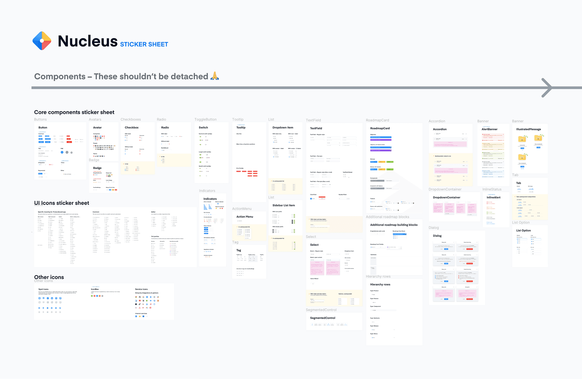
Our libraries
Upon first interacting with our Figma libraries, they clearly hadn't been updated recently. They needed attention regarding Auto Layout, enhanced Figma properties and deprecating the large variant amounts currently supported in design and React.
Because of Productboard's huge product offering, Nucleus doesn't support every part, so separate domain design systems were implemented for individual purposes. The intention was close collaboration with the core library, but over time disjoining occurred naturally—the product grew faster than DS could support.
Large component variant volumes and a lack of accessibility consideration were key areas to address in our libraries.
State of product UI
Moving at this pace naturally means skipping hurdles. Productboard's customer interface is very detailed with lots of moving parts, so managing a holistic style guide was challenging, especially with multiple teams contributing quickly.
Misalignment in React
As teams and product scaled, this pressured the Nucleus engineering capacity. Code contributions are invaluable, but when custom components were added without proper governance, the repo became bloated with many components having only a couple of usages. This creates problems such as:
Searching and finding the right component
Trust that contributions were added correctly
Health status considering usability and accessibility
Along with refactoring our Figma library, we formulated a plan for merging and deprecating bulk React components—aiming to bring greater parity between design and code in naming and application.
Challenge two
What to introduce first
Though I identified key focus areas, feedback from the design team confirmed that refactoring the core component library would be most beneficial. This would take time, but going back to foundations and analysing how we name, design and craft components would lead to better understanding, easier discoverability and faster scalability.
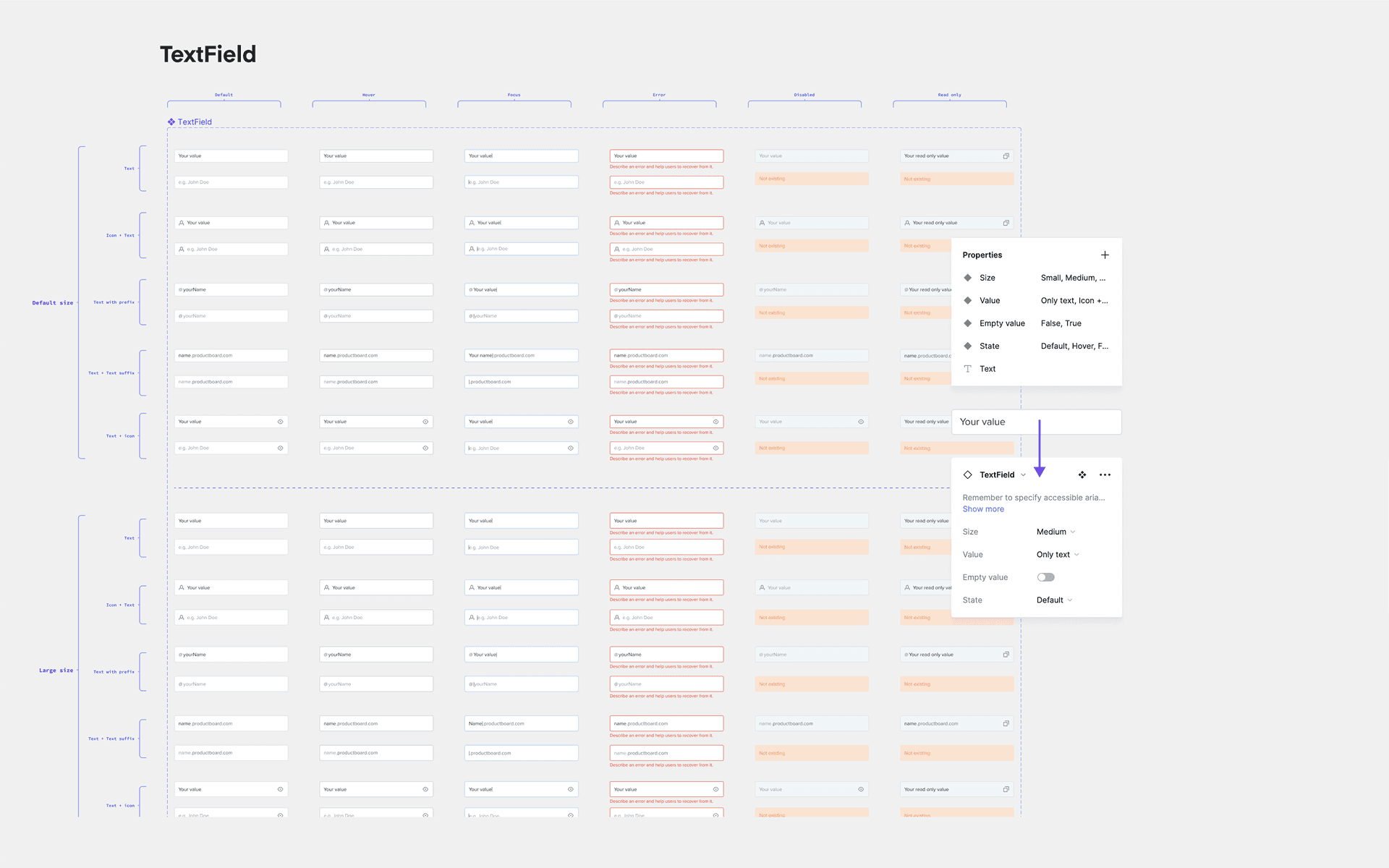
By reworking our core component library I was able to reduce the variant volume significantly, whilst providing improved component property usage.
Refactoring
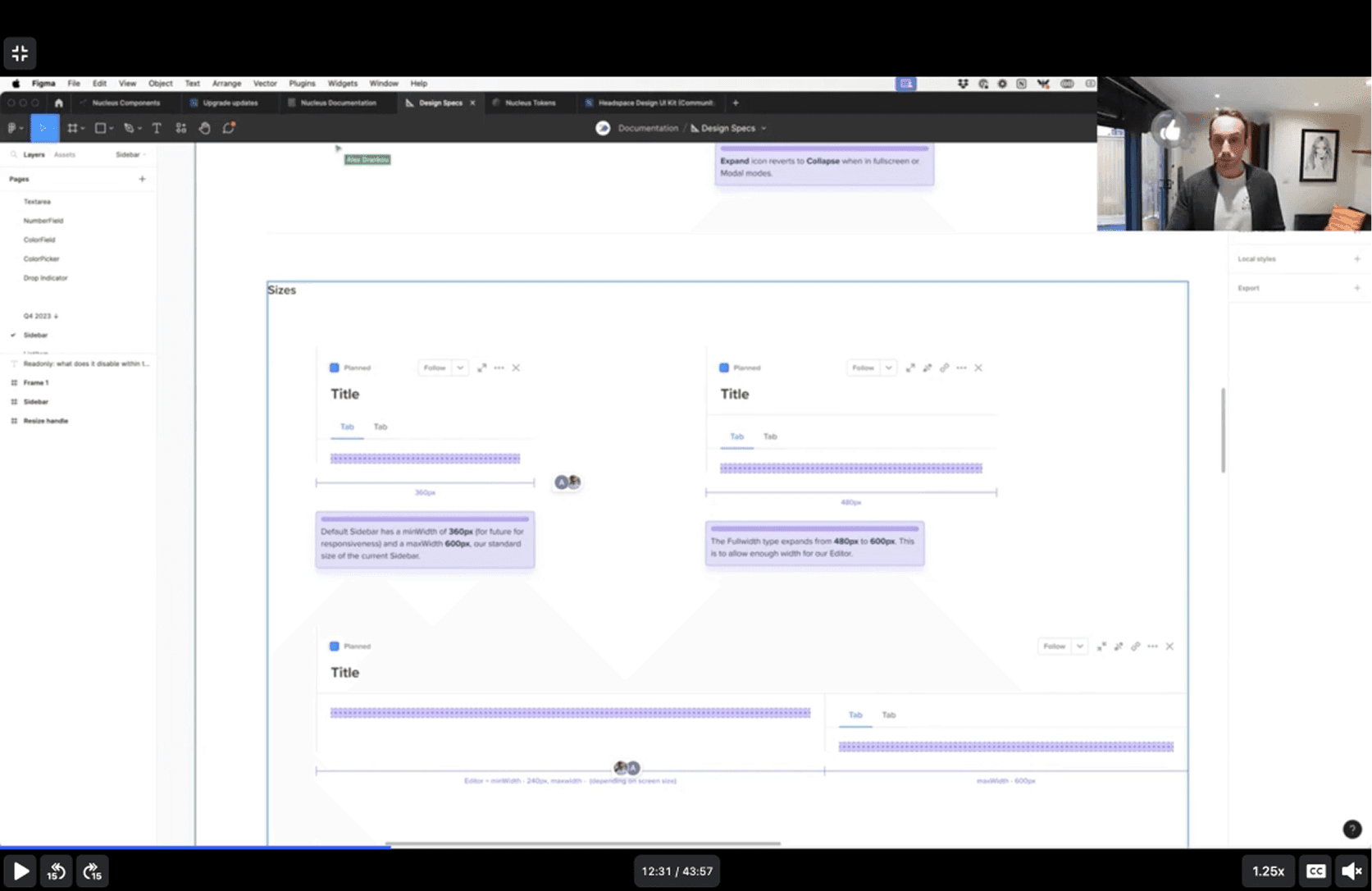
Reworking components was relatively quick, as stylistically I wasn't moving far from what existed. Improvements were in how they were created: reducing variants by utilizing Figma's properties update, fixing alignment issues, and general accessibility improvements in colour usage. The endgame was better adoption within product UI and fewer detachments, particularly with larger patterns like Modals and Menus where empty slots nest components.
Contributing modal
One of Productboard's design principles is efficiency. From a Nucleus perspective, I wanted designers to consider how and when to contribute. Without discouraging this, using existing design system parts before adding new elements cuts production time and cost. The idea was encouraging system-thinking and creativity with what we had available. Regular design pairing sessions facilitated this approach and reduced support time.
Working in existing constraints
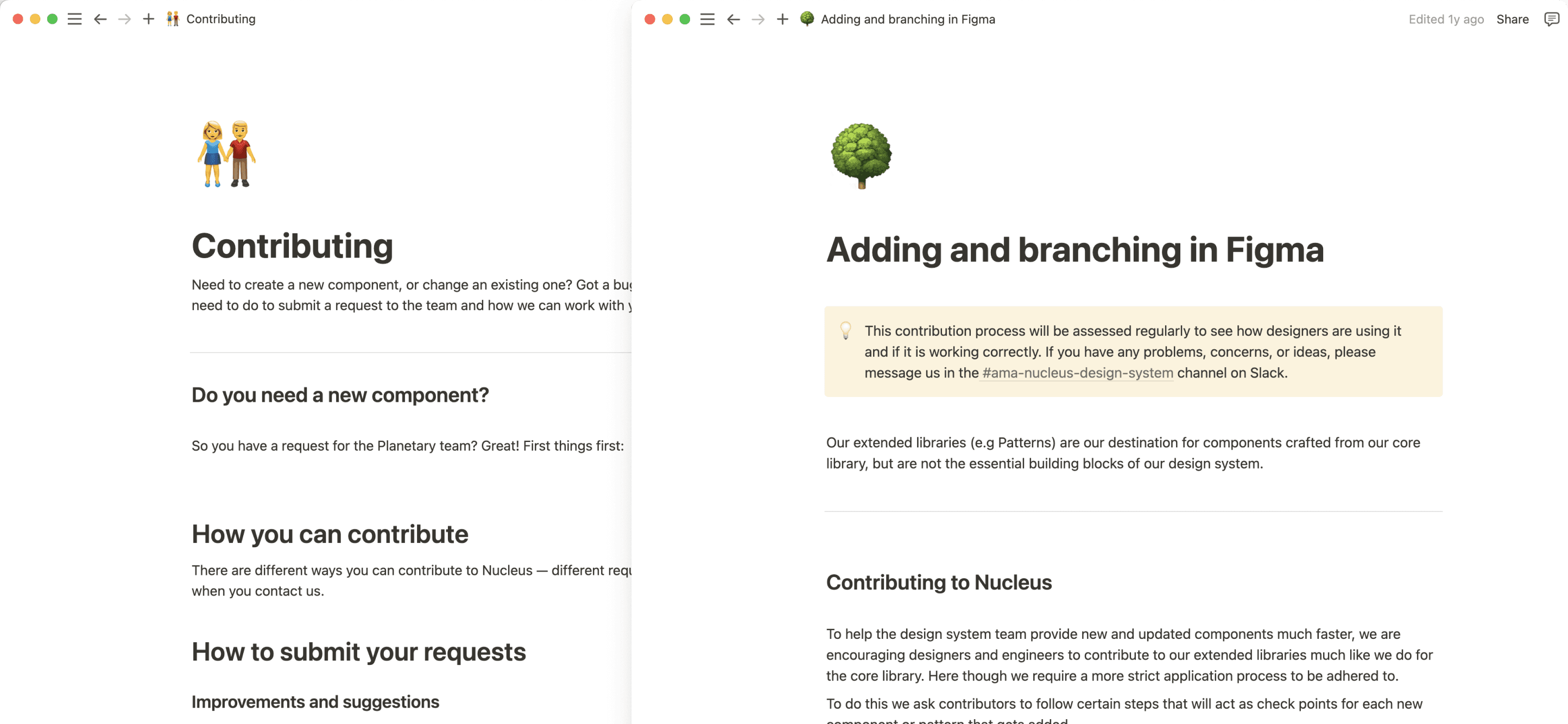
The product has been around since early 2014 and hasn't changed visually much. Branding and user interface are closely tied with plenty of stakeholder opinion. This gave me rough thinking to work with, but we lacked specific guidance on component usage and working with Nucleus. A dedicated documentation space was needed for this detail.
Challenge three
Documentation
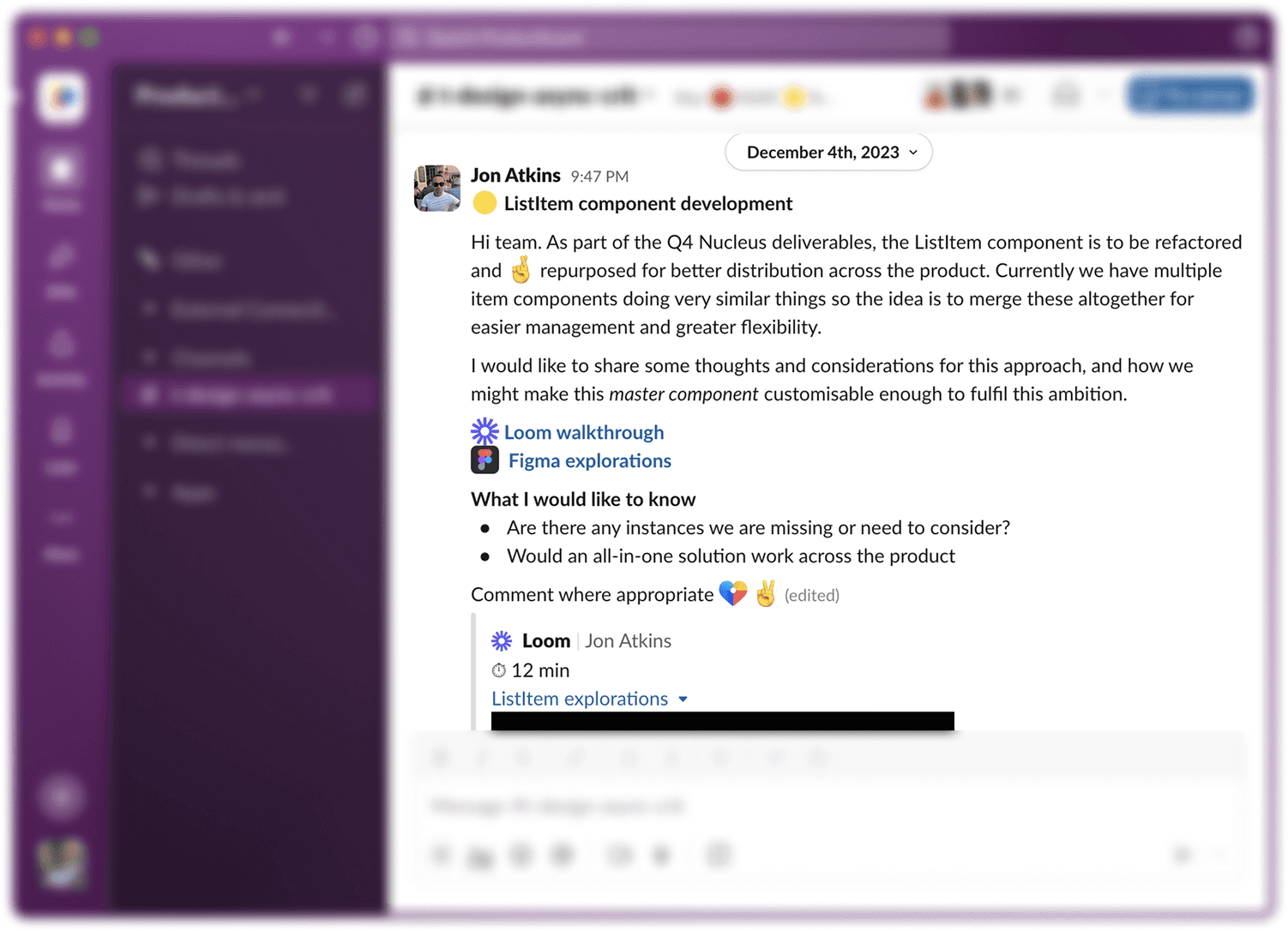
Early foundational documentation had begun before I joined but was basic and needed updating. We used Supernova as our DS management tool to document all usages, code and copy content, plus detailed token management. I included quarterly survey analysis, changelogs of latest Nucleus releases and component health status during refactoring.
Announcement plan
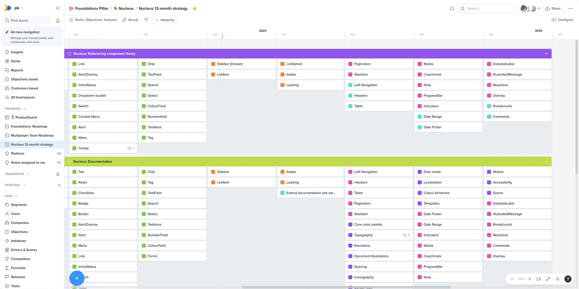
Refactoring consisted of many moving parts beyond design tweaks. React implementation and documentation had to be tested, reviewed and completed before announcing to teams. Component complexity determined migration time allowed for designers; a Tier 1 component like Tag needed one week, but a Tier 3 component like Modal was given 4 weeks due to greater understanding required.
Survey
Design systems aren't customer-facing, but they're nonetheless products needing to be user-friendly and tested—the customers being internal. To get valuable insights from design and engineering, a quarterly survey was sent out with scoring questions on satisfaction and usability plus open-ended challenges and improvement suggestions. It's easy assuming my changes were helpful, but this isn't always the case, especially during migration causing legacy headaches.
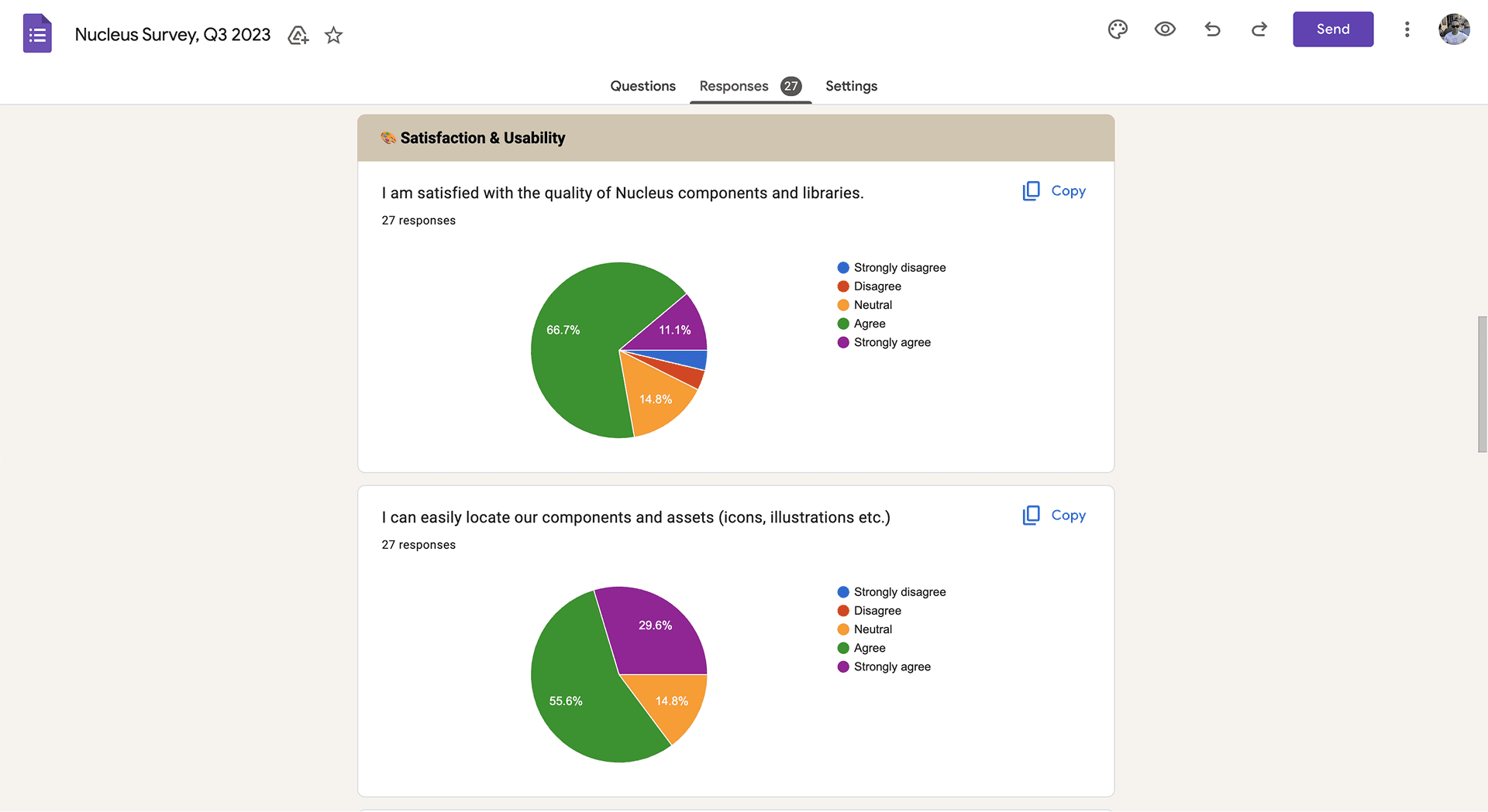
Survey results make up part of my quarterly Nucleus newsletter for the product teams.
I created quarterly newsletters highlighting component high and low points, documentation sentiment, component usage (volume and detachment %), deprecation levels, Supernova analytics and what's coming next quarter. This detailed breakdown helps management and execs understand how the design system improves product quality for customers while saving development time and costs—the huge value of an adopted, well-maintained design system.
Challenge four
Way of working with Productboard
A major plus point when first talking to Productboard was their design process. Coming from a start-up that was erratic, so hearing the strong business strategy and a process the whole team followed was refreshing. Nucleus is integral to this process, so being transparent with teams on our process and progression is expected practice.
Focus time is vital, but gathering thoughts across the business makes the design system mature correctly, providing content and context users need. In all Nucleus areas, feedback helped me address queries on component crafting, usage or documentation announcements.
Team feedback through Slack, Notion and Loom videos—especially critiques—drove design system evolution by fostering collaboration and improving adoption rates.
Sharing
Providing explorations and WIP teasers helped designers understand the application that goes into design system contributions, demonstrating detail we adhere to and expect from designer contributions. This shareable content wasn't specifically for components, but also foundational and structural design system information, best practices and workshop demos.
Design critiques
Weekly design crits allowed designers to share work for feedback. For me, this was a chance to see how the team includes components and how they're utilized user experience-wise. You quickly see opportunity areas for improvement and what's misunderstood when components are used in product.
The impacts of these changes on the design system
Making large structural changes should naturally improve the design system, but this takes time with inevitable crossover between legacy and updated elements across design files and code base. There's no straightforward refactoring process, and designers particularly struggled with reworking larger components using slots, having that mix of old and new components during library updates and general ease of use, leading to detachments.
Being clear to raise potential issues at the start gave me a stronger mandate while refactoring, but providing guidance via ad-hoc calls, demos and announcements during this time helped reduce impact.
Within Engineering, Product and Design
Design systems are notoriously difficult to monitor successfully over time, making it tricky to sell into the business and provide numbers. Being part of monthly check-ins with execs along with other team PMs was valuable and something I'd support for any design system team. They're part of the product and should get equal attention and praise.
For the product
Productboard had been in sustained growth before I joined, with emphasis on feature development over usability. 2023 became the year of refinement (and an AI product push), giving me the chance to work on merging and deprecation in React, more flexible and reusable components, and going back to foundations to improve accessibility. This was never taken seriously, but as the business grew, needing to attract enterprise customers, being more accessible would have real impact on the product.
" Jon had an un-easy job when he landed in the Nucleus team. He had to take full ownership of an already well-set-up design system and many libraries on the design side. During this time he modelled various ownership competencies inside our domain - from setting up long-term strategy for our team, refactoring almost every component and thus improving the overall domain health, to huge commitment and accountability since he is a one-man army. I'm glad to have worked with such a strong design leader. "
Metrics
Looking at analytical data we've seen core components increase from 31 to 42 (+35%), which seems like more to support. But in fact, we were either taking these from domains as they were used in multiple product parts and we could now maintain them correctly, or there was need for new component additions like Date Picker or Pagination that weren't previously supported.
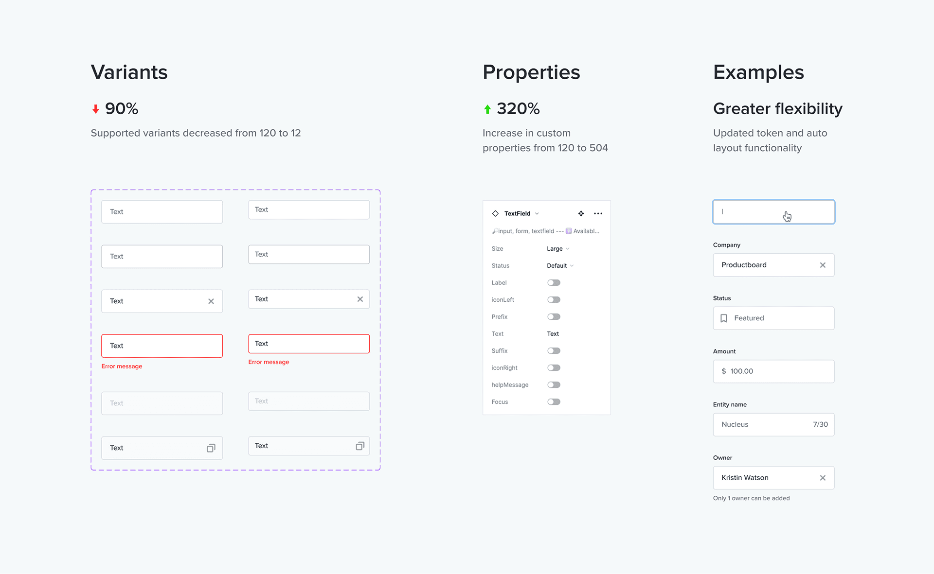
increase of Core component support from 31 to 42
decrease of variants supported in Figma, down from 3192 to 879
improvement in parity between design and code
The biggest wins were decreased variants supported in Figma, down from 3192 to 879 (-72%), and code deprecation from the React repo. With this removal of legacy design and code, our parity between both has increased to over 84%. This is what really matters as both design and engineering can be confident working with our components, reinforcing React as our source of truth.
Credits
©2017—2026 Selected works / Jon Atkins